
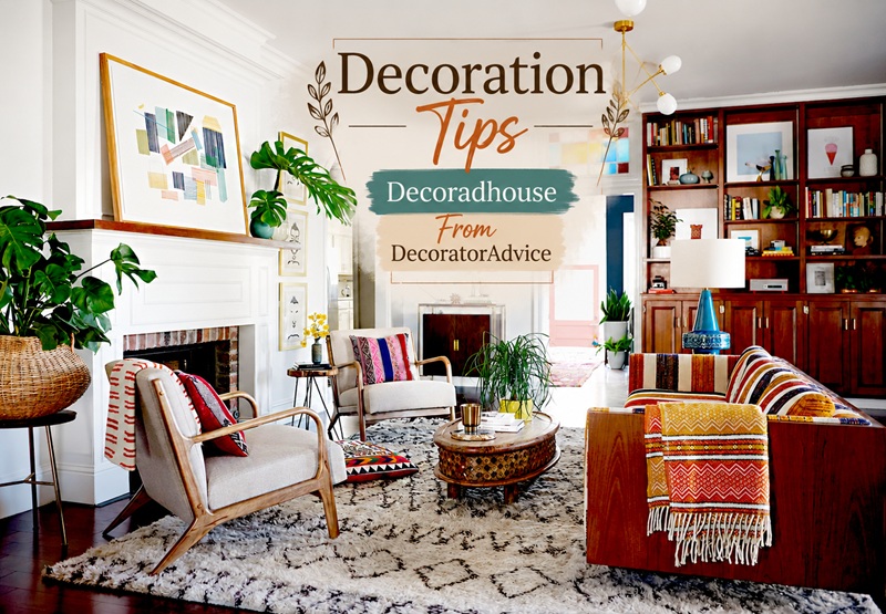
The gap between a room that looks designed and a room that merely looks furnished is rarely a matter of budget. It is almost always a matter of knowing which decisions carry the most weight and making those decisions deliberately rather than by default. The decoration tips that professional decorators return to again and again are not complicated — but they are consistently overlooked, and the rooms that ignore them consistently look less resolved than the rooms that apply them.
This guide brings together the most practical and highest-impact decorator advice available, organised by the decisions that matter most — from the foundational choices about colour and proportion to the finishing details that give a room its character.
What Is the Most Important Decoration Tip Decorators Give?
The single piece of decorator advice that professionals cite more consistently than any other is this: decide what the room is for before deciding how it should look.
Every good decoration decision flows from a clear understanding of the room’s function. A living room used primarily for quiet reading and conversation needs different furniture, different lighting, and a different atmosphere than a living room used primarily for family film nights and children’s homework. A bedroom that is also a home office needs different storage, different lighting, and a different approach to visual quietness than a bedroom used only for sleeping.
When decoration begins with aesthetic choices — a paint colour seen online, a sofa spotted in a showroom — without first establishing what the room needs to do, those choices often produce rooms that look good in photographs but do not work in daily life. Start with function. The aesthetic follows more naturally and more successfully when it is in service of a clear purpose.
How Do You Choose the Right Paint Colour for a Room?
Paint colour is the decoration decision with the most impact on how a room feels, and it is the one most frequently made incorrectly. The most common mistake is choosing a colour from a small paint chip under the fluorescent lighting of a paint shop, taking it home, and discovering it reads completely differently on the wall.
The decorator approach to paint colour selection involves three steps that most homeowners skip.
First, sample the colour at large scale. Paint a section of wall at least 30 by 30 centimetres — ideally on the actual wall rather than on a separate piece of card — and live with it for at least 48 hours across different times of day and different lighting conditions. A colour that looks warm and inviting in morning light can read cold and flat in the artificial light of an evening. A colour that reads neutral at midday can look strongly blue or green in the light of an overcast afternoon.
Second, consider the room’s light quality before selecting the colour range. North-facing rooms receive cool, indirect light throughout the day and benefit from warm-toned colours that counterbalance that coolness. South-facing rooms receive warm, direct light and can accommodate cooler or more neutral tones that might feel cold in a north-facing equivalent. East-facing rooms are warm in the morning and cool in the afternoon. West-facing rooms reverse this pattern.
Third, choose the finish as carefully as the colour. A flat or matte finish absorbs light and makes colour read richer and deeper — it suits period rooms and creates an enveloping quality that eggshell and satin finishes cannot achieve. Eggshell has a slight sheen that makes colour read slightly lighter and that provides a more washable surface suited to hallways and family rooms. Gloss is appropriate only for woodwork and specific architectural details.
The current direction in decorator advice moves away from cool grey and crisp white as default wall colours toward warm neutrals — cream, taupe, warm beige, soft greige — that create inviting, layered rooms without requiring extensive redecoration as tastes change.
What Is the Most Common Furniture Arrangement Mistake?
Pushing all the furniture against the walls is the most consistently cited furniture arrangement mistake in decorator advice, and it is one that appears in the majority of rooms that have never been professionally arranged.
The instinct to push sofas and chairs against the walls comes from a desire to maximise floor space. In practice, it produces the opposite of its intention: furniture arranged around the perimeter of a room leaves a large empty space in the middle that reads as wasted rather than generous, and it creates a seating arrangement that is too spread out for comfortable conversation — people sit too far apart from each other to talk naturally.
The decorator approach to furniture arrangement in a living room is to float the seating — to pull it away from the walls and arrange it around a central point, typically a coffee table, a fireplace, or a rug. This creates a defined conversation area that feels intimate and purposeful. The space between the back of the sofa and the wall is not wasted space; it reads as breathing room that makes the furniture grouping feel confident rather than compressed.
The key dimensions to know: allow at least 45 centimetres of walkway between the edge of a sofa or chair and any nearby wall or other furniture. Allow 35 to 45 centimetres between a sofa and a coffee table — close enough to reach a drink without leaning uncomfortably, far enough to move through without catching shins. A coffee table that is approximately two-thirds the length of the sofa it serves is the correct proportion.
Why Do Decorators Always Talk About the Importance of Rugs?
Rugs are the decorator tool that produces the most immediate and most significant transformation of any furniture arrangement, and they are the element most frequently purchased in the wrong size.
The decorator rule for rug sizing is straightforward: in a seating arrangement, all the main furniture pieces should have at least their front legs on the rug. A rug that sits only under the coffee table — the most common error — floats the furniture above it and makes the seating arrangement look disconnected from the floor. A rug large enough for the front legs of all the main seating pieces to rest on anchors the arrangement and defines the conversation area as a coherent zone within the room.
In a dining room, the rug should extend at least 60 centimetres beyond the edge of the table on all sides, so that the chairs remain on the rug when pulled out for seating. A dining room rug too small to accommodate occupied chairs looks as though it was measured incorrectly, regardless of how well everything else is designed.
The most useful piece of decorator advice on rugs is to mark out the intended rug size on the floor with masking tape before purchasing. The tape shows exactly how the dimensions will read in the room and almost always reveals that a larger rug than initially planned is the correct choice.
What Does Good Lighting Actually Mean in a Decorated Room?
Lighting is consistently cited by professional decorators as the element that most separates a well-designed room from a merely furnished one, and it is the element that receives the least attention in most non-professional interior projects.
The fundamental principle of decorator lighting advice is layering. A room lit by a single overhead light source — the default condition in most homes — is lit evenly and flatly. Every corner receives the same level of illumination, every surface reflects the same quality of light, and the room has no depth, no atmosphere, and no sense of deliberate design.
A properly layered room has three levels of light working together.
The first level is ambient or general light, which provides the base level of illumination for the room. This can come from a central pendant, from recessed downlights, or from wall sconces providing indirect light. It should be on a dimmer — the ability to reduce the ambient light level in the evening is one of the most transformative and least expensive lighting improvements available.
The second level is task lighting, positioned specifically to illuminate the activities that take place in the room — a reading lamp beside the armchair, under-cabinet lighting in the kitchen, a desk lamp in the study area.
The third level is accent lighting, used to highlight specific features of the room — a picture light over a painting, an LED strip inside a bookshelf, a small lamp on a mantelpiece that draws the eye to the fireplace. Accent lighting creates focal points and depth that ambient lighting alone cannot produce.
The colour temperature of all bulbs in a residential room should be 2700K — the warm amber tone that makes natural materials glow, flatters faces, and creates the kind of evening atmosphere that a well-decorated room should produce. Cool white bulbs (4000K and above) produce a clinical quality that works against warmth regardless of how carefully everything else has been chosen.
What Is the Decorator Advice on Mixing Patterns and Textures?
Pattern mixing is one of the areas where decorator advice most often conflicts with the instinct of homeowners who have not studied design. The instinct is to be cautious — to use one pattern and keep everything else plain, for fear of the room looking busy. The decorator approach is more confident: patterns can be mixed freely, provided they follow certain structural rules.
The most reliable pattern mixing framework used in decorator advice involves three scales. Choose one large-scale pattern — a bold floral on a curtain fabric, a geometric rug with a significant repeat, a wide stripe on upholstery. Choose one medium-scale pattern — a smaller floral, a ticking stripe, a modest check. Choose one small-scale or textural pattern — a subtle weave, a fine herringbone, a plain linen with visible slub. Keep all three patterns within the same colour family, and the combination will read as layered and considered rather than chaotic.
Texture mixing follows the same principle of variation within coherence. A room with a single texture — all smooth surfaces, all plain fabrics — reads as flat regardless of how carefully the colours have been chosen. A room that mixes rough with smooth, matte with reflective, hard with soft, woven with knitted, creates the kind of sensory richness that makes a space feel genuinely designed.
The decorator rule for texture in a well-dressed room is that no two adjacent surfaces should have the same texture. A smooth linen sofa cushion sits next to a chunky knit throw. A matte plaster wall sits alongside a glossy ceramic lamp base. A rough jute rug sits under a smooth timber coffee table. The contrasts give the room its depth.
What Are the Decoration Tips Decorators Give for Small Rooms?
Small rooms are the context in which decoration decisions have the most consequence, and the decorator advice for them is often counterintuitive.
The conventional wisdom says to keep small rooms light and neutral to make them feel larger. The decorator approach is more nuanced: what makes a small room feel uncomfortable is not its size but its lack of design intention. A small room with clear purpose, confident colour, and well-chosen furniture often feels more successful than a larger room that is poorly resolved.
The decoration tips that produce the most improvement in small rooms are not primarily about making the room appear larger. They are about making it feel right for its size.
Use one dominant colour and limit the palette to three tones at most. Visual complexity created by many competing colours makes a small room feel crowded in a way that a rich, immersive single colour does not. A small dining room painted in a deep forest green or a warm navy, with all woodwork in the same or a closely related tone, feels intimate and deliberate rather than simply small.
Choose furniture that is correctly proportioned for the room rather than scaled down to the minimum. A very small sofa in a small living room looks undersized and nervous. A sofa of correct proportion for the seating needs of the room, even if it is fairly substantial, looks confident and correct.
Take curtains to the ceiling regardless of where the window sits. Floor-to-ceiling curtains make the window appear taller, the ceiling appear higher, and the room appear more generous than it is.
Take one element — a bookshelf, a picture gallery, a painted panel — to the full ceiling height. The vertical emphasis draws the eye upward and makes the ceiling feel further away.
What Are the Most Overlooked Decoration Tips from Decorator Advice?
Several decoration decisions that professional decorators cite as fundamental are consistently overlooked in non-professional projects.
The height at which artwork is hung is one of the most common errors in home decoration. Most people hang pictures too high. The decorator standard is to hang the centre of the artwork at approximately 145 to 150 centimetres from the floor — roughly average eye level when standing. Artwork hung at this height feels connected to the room and to the people in it. Artwork hung significantly higher reads as though it is floating above the room rather than belonging to it.
The weight and length of curtains is regularly underestimated. Curtain panels that are too short, too narrow, or too lightweight drain the energy from an otherwise well-decorated room. The decorator standard is curtains that reach the floor, that are generous in width (a total fabric width of at least twice the rod width for any gathered treatment), and that are made from a fabric with enough body to hang well.
The scale of decorative objects is another area where decorator advice consistently contradicts home decoration instinct. A small object on a large surface disappears. One large object or a group of three objects of varying heights reads as deliberate and considered. Decorator advice on mantlepieces, coffee tables, and shelves consistently favours fewer, larger objects over many small ones — a single large ceramic vase rather than five small ones, a group of three candles at different heights rather than a scattered collection.
Editing is the decorator skill that most distinguishes professional results from amateur ones. A professional decorator removes things as often as they add them. Every object in a well-decorated room is there because it contributes something — material quality, visual balance, personal meaning, or functional purpose. Objects that are merely present without contributing anything are subtracting from the room rather than adding to it, even when they are individually attractive.
What Are the Best Decoration Tips for Period Homes?
For Georgian, Victorian, and Edwardian properties, the most valuable decoration advice is to treat the existing architecture as the primary design resource rather than as a neutral backdrop for contemporary furnishing.
The cornicing, ceiling roses, sash windows, panelled doors, picture rails, and fireplaces of a period property are design assets of enormous value. They provide scale, character, three-dimensionality, and historical depth that no amount of contemporary decoration can replicate. Every decoration decision should be made in awareness of these features and in service of highlighting rather than concealing them.
Paint the cornicing and ceiling rose in the same colour as the ceiling — not in a contrasting white — if you want to create the enveloping effect that makes a period room feel complete. The convention of picking out architectural plasterwork in brilliant white was a mid-20th-century innovation that stripped period interiors of their tonal richness. Returning to the period practice of treating ceiling surfaces as a unified whole, in a warm off-white or even a tone slightly lighter than the walls, produces a more historically accurate and more atmospherically successful result.
Use the picture rail. Hang artwork from the picture rail using appropriate hooks and cord rather than drilling into the plaster below it. This preserves the wall surface, allows flexibility in rearranging the room, and relates to the architectural function the rail was designed to serve.
Invest in window treatments proportionate to the window size and room scale. Georgian and Victorian sash windows are generous, tall, and characterful — they deserve curtains that acknowledge their scale. Floor-to-ceiling curtains in a quality fabric, hanging from a rod mounted close to the cornice, honour the window architecture in a way that short or narrow curtains cannot.
Keep the pattern vocabulary of the room coherent with its period. A Georgian drawing room with a Regency stripe on the curtains, a botanical print on a sofa, and traditional raised panel shutters speaks a consistent period language. The same room with contemporary geometric patterns and industrial accessories produces a jarring result regardless of how well-chosen each element is individually.
The Fundamental Rule Behind All Good Decorator Advice
Every piece of decoration advice in this guide, and in any reputable source of decorator guidance, derives from a single principle: the room should serve the people who live in it, and every decoration decision should be evaluated against that criterion.
A room that looks beautiful but does not work — where the lighting is inadequate for reading, the furniture arrangement does not facilitate conversation, the storage is insufficient for the objects that need to be stored — is not a well-decorated room regardless of how considered its choices appear. A room that works perfectly but looks unconsidered — where the function is solved but no attention has been paid to colour, proportion, material quality, or the relationship between elements — is equally incomplete.
The rooms that decorator advice consistently produces at its best are rooms that are both beautiful and useful, where the aesthetic choices and the functional choices are the same choices, made simultaneously in service of the life that will actually be lived there.
That is the goal of decoration, and it is what distinguishes the best decorator advice from the decorative equivalent of furniture arranged against the walls.