
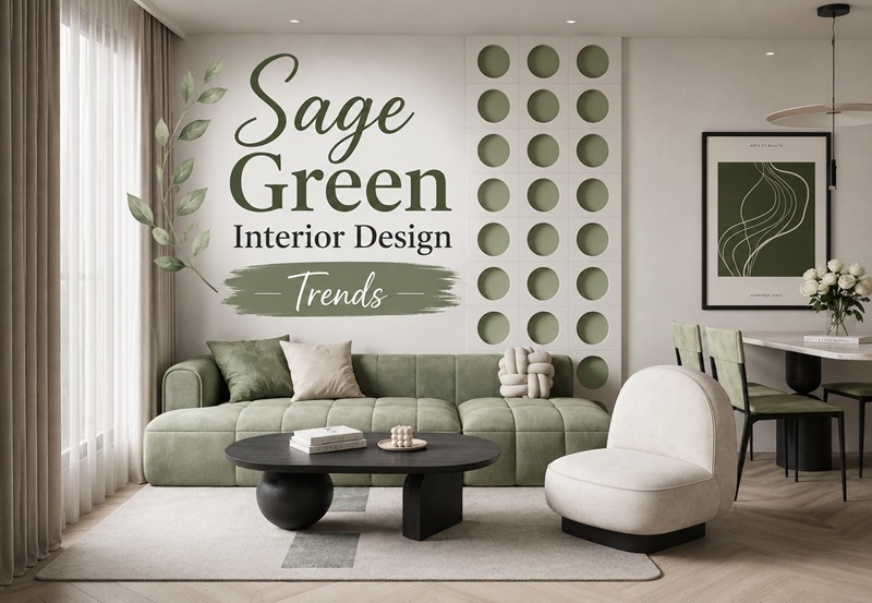
Sage green has spent the past several years as one of the most beloved colors in interior design, and in 2026 it occupies a fascinating position. Valspar named a sage-toned shade, Sage Slate, its 2026 Color of the Year, and designers continue to reach for the color in homes across the country. At the same time, a genuine debate has emerged among design professionals about whether sage has peaked and where the color is heading next. Understanding both sides of that conversation is the key to using sage green in a way that feels current rather than dated.
This guide covers why sage green became so popular, how it is being used in 2026, the honest debate about its future, and how to work with the color so your home feels fresh and intentional.
Why Sage Green Became So Popular
Sage green is a soft, muted, gray-toned green inspired by the herb it is named after and by natural, earthy landscapes. Its enduring appeal comes down to a rare combination of qualities. It is calming and easy to live with, it connects a space to nature, and its gray undertone allows it to behave almost like a neutral while still bringing genuine color and life into a room.
That versatility is central to its success. Sage pairs beautifully with wood, brass, warm whites, and a wide range of earth tones, and it works across nearly every design style, from modern farmhouse to traditional to contemporary. It suits period properties steeped in history just as naturally as it suits new builds. Because it adds color without overwhelming a space, it became one of the safest yet most stylish choices available, particularly popular in small rooms where bold colors can feel overpowering.
Its rise was cemented when a gentle sage was named a major paint brand’s Color of the Year in 2022, and the color has remained beloved by many homeowners ever since.
How Sage Green Is Being Used in 2026
In 2026, sage green remains a strong presence in interior design, though the way it is being used has matured. Rather than being splashed across every surface, it is increasingly deployed with more intention and nuance.
On walls, sage continues to work beautifully as a calming backdrop, especially in bedrooms, kitchens, and bathrooms where a soothing atmosphere is welcome. Designers increasingly recommend pairing it with warm off-whites rather than stark, cool whites, and a popular contemporary approach involves color-drenching, painting the walls, trim, and even the ceiling in the same sage tone to create an enveloping, cohesive effect rather than a single accent wall.
Sage is also thriving beyond the walls. It has become a particularly popular choice for upholstery and bedding, allowing homeowners to introduce the color through a sofa, headboard, or textiles without committing to it on every surface. A sage green sofa introduces color while still blending into a neutral palette, especially in designs with slim legs or raised bases that keep a space feeling light and open.
Texture is central to using sage well in 2026. The most successful sage interiors layer materials like linen, wood, and woven natural fibers in similar tones, creating depth and richness without clutter. This tonal, textural approach is what elevates sage from a simple wall color into an atmospheric, sophisticated scheme.
What Colors Go With Sage Green?
One reason sage green endures is how well it plays with other colors, and knowing its best partners is essential to using it successfully.
Warm off-whites and creams are the natural companions, creating a soft, calm foundation without the harshness that stark white can bring. Wood tones and browns bring out sage’s earthy quality and add warmth. Blues and plums create a slightly richer, more layered look. Pale pink offers a gentle, sophisticated contrast that works beautifully in traditional and country-style rooms. And darker woods provide grounding contrast that keeps a sage scheme from feeling too soft.
Brass and gold metals are particularly flattering against sage, adding a touch of warmth and elegance, which is why sage kitchens and bathrooms so often feature brass hardware and fixtures.
The Honest Debate: Has Sage Green Peaked?
Any genuinely useful trend guide has to address the real conversation happening among designers, which is more nuanced than most articles admit. While sage green remains popular and even holds a Color of the Year title for 2026, a number of designers have begun to describe it as overexposed.
The criticism is that sage has become so ubiquitous over the past few years, appearing everywhere from fashion to home decor, that some designers now call it the new millennial gray, suggesting it has become safe, predictable, and lacking the depth that richer green hues can offer. The more desaturated, gray-leaning versions of sage in particular are increasingly read as a pandemic-era palette that some designers feel ready to move past.
This does not mean sage green is disappearing. The consensus is more subtle than that. Sage is transitioning from a dominant, do-everything wall color into a supporting role, used as an accent through upholstery, bedding, and textiles rather than as the defining color of an entire home. Homeowners who love it can absolutely still use it, but the most current approach treats it as one considered element in a scheme rather than the whole scheme.
The Greens Emerging Alongside Sage
For those who love the calming, nature-connected quality of sage but want something that feels fresher in 2026, designers are pointing toward a broader spectrum of greens with more depth and character.
Softer, cleaner greens like eucalyptus and moss are gaining favor for feeling more uplifting than gray-toned sage. Valspar’s Warm Eucalyptus, one of the year’s notable paint colors, offers a similar warmth to sage but with more depth. Olive and characterful, earthy greens bring a richer, more grounded quality. At the bolder end, deeper shades like forest green and emerald channel the same connection to nature as sage but with far more drama and richness, working beautifully in kitchens and as jewel-toned accents.
The broader movement in green is toward tonal variation, materiality, and how color interacts with light, rather than reliance on a single obvious shade. Green has become, as one designer put it, less decorative and more atmospheric.
How to Use Sage Green So It Feels Current
If you love sage green and want to use it in a way that feels fresh rather than dated in 2026, a few principles help.
Lean warm rather than gray. The warmer, softer sages with a green undertone feel more current than the flat, desaturated gray-greens that now read as dated. Pair sage with warm whites, natural wood, and organic textures rather than cool grays and stark whites.
Use it with depth and texture. A flat expanse of sage on a wall is what feels tired. Sage layered through varied textures, linen, wood, woven materials, and grounded by contrast from darker woods or brass, feels rich and intentional.
Consider it as an accent rather than the whole room. Introducing sage through upholstery, bedding, tile, or cabinetry rather than drenching every wall keeps it feeling deliberate and lets it complement more current paint choices.
Combine it thoughtfully. Sage paired with plum, pale pink, warm brown, or brass reads as considered and sophisticated rather than defaulting to the familiar sage-and-white combination that has become so common.
Frequently Asked Questions
Is sage green still in style in 2026?
Yes, though its role is shifting. Sage green remains popular and even holds a 2026 Color of the Year title, but many designers now use it as a supporting accent through upholstery and textiles rather than as a dominant wall color. Warmer, softer sages feel more current than flat, gray-toned versions.
What colors pair best with sage green?
Warm off-whites, natural wood tones, brass and gold metals, and earthy browns are the most flattering companions. For more contrast, sage pairs beautifully with plum, pale pink, and soft blues.
What is replacing sage green?
Rather than a single replacement, designers are exploring a wider range of greens with more depth, including warm eucalyptus, olive, moss, and richer forest and emerald tones. Warm neutrals and earthy shades with more character are also gaining ground.